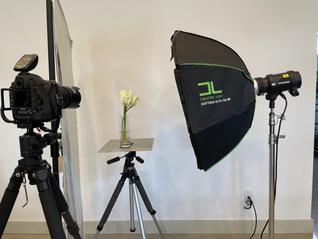
Initial Setup with light in front washing over the flowers and lighting the white wall at the same time.
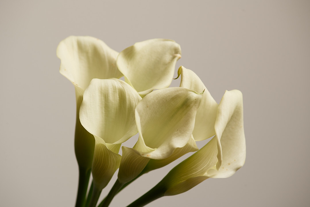
I held a Macro Flower and Still Life workshop in early March. I have been playing with the flowers on and off since that workshop. Today I decided to write a blog post showing how with just one light I was able to create a variety of very different looks. The image above was shot with the light higher than the flowers, aimed down, from camera right. I like the result, but the flowers are starting to show their age.
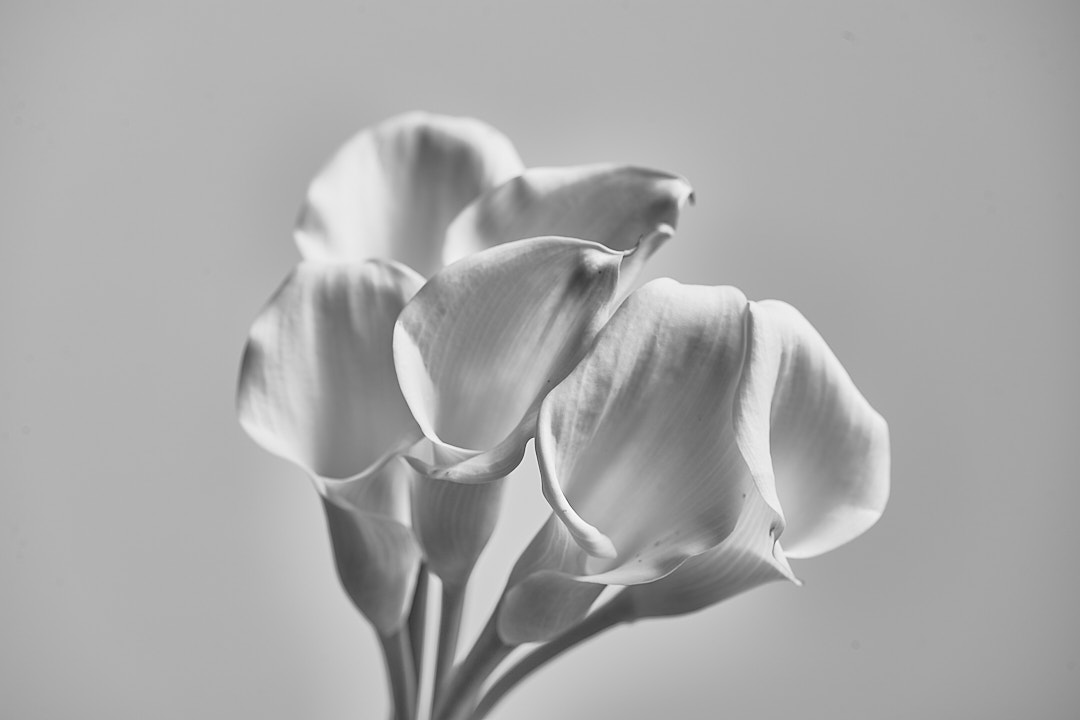
So I decided to covert the image to Black & White in Capture One 21 so the yellowing wasn’t noticeable.
I like this image better in B&W but I felt like a darker background would help the Lillies pop.
Solution: Keep the light off the white wall
I move the light upward and turned it so the back edge of the soft box was lighting the flowers and much of the light was going in front of the flowers…away from the wall. This resulted in the background going almost pure black. I am still shooting in the exact same spot, I just kept the light from hitting the wall. The resulting image looked okay in color, but I definitely prefer the B&W.
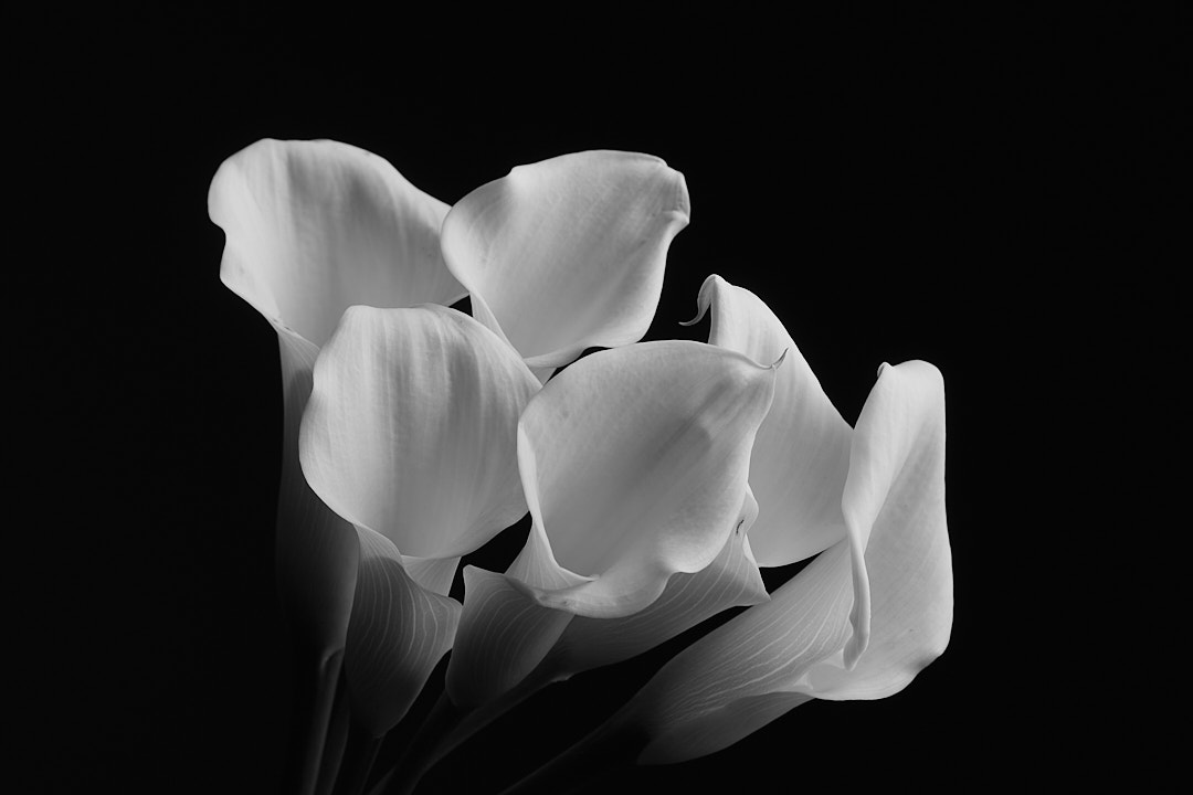
Hard to believe the same light with a minor repositioning resulted in such a dramatic change. When you start to play with studio lighting, make time to experiment. You will have a great time and be amazed at how many different looks you can create with subtle changes.
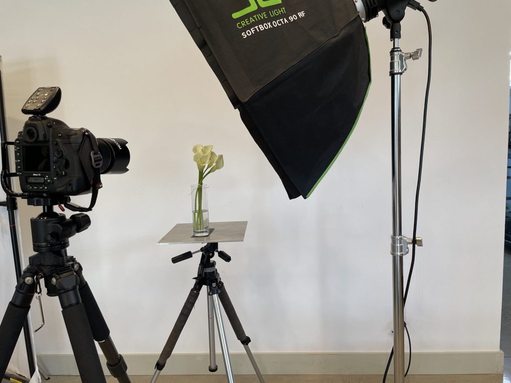
Lastly, wanted more pop in the image
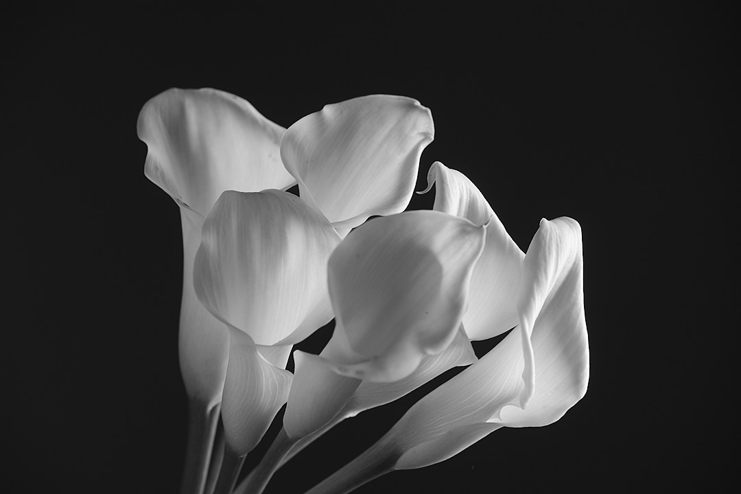
In this last shot I wanted the flowers to be back light for more pop. If ou look at the behind the scenes for the last shot compared to the previous one you will see I lowered the box and brought it around and behind the arrangement more to fire light through the flowers rather than “on” them. The behind the scenes pictures with my iPhone took more time than it took to adjust the light.
Sorry, comments are closed for this post.